CyberLink PowerDirector Help
To create a new shape in the Shape Designer, do this:
1.Click on  and then
  at the top of the library window to open the Shape Designer.
2.Click on the Properties tab.
3.Select the type of shape you want to create.
4.If required, select one of the available shape presets.
5.Use Shape Fill to customize the color, opacity, and more for your shape.
6.In the Shape Outline and Shadow sections, you can customize the shape's border and give it a shadow.
7.If required, you can add title text to your shape.
8.When you are done, click OK to save your new shape in the video overlays library.
Note: while modifying the shape properties, you can select the Only show the selected track option to hide any other media that is displayed in the preview window. |
Selecting a Shape Type
Click on the Shape Type option to select the type of shape you want to create. You can choose from one of the following shape types:
•lines and arrows.
•geometric shapes.
•callouts and speech balloons.
To select the shape you want to use, just click on it. Once selected, you can change its size, shape, position, and orientation.
Modifying Shape Size, Shape, Position, and Orientation
You can change the size, shape, position, and orientation of most of the shapes. Some of the shapes allow you to change how they are displayed by adjusting their appearance.
Note: click on |
To modify shape size, shape, position, or orientation:
Note: hold down the Alt key on your keyboard when moving or resizing shapes in the project preview window to temporarily turn off the snap to feature for smoother movement and placement. |
•click and drag a corner or side to resize the shape.
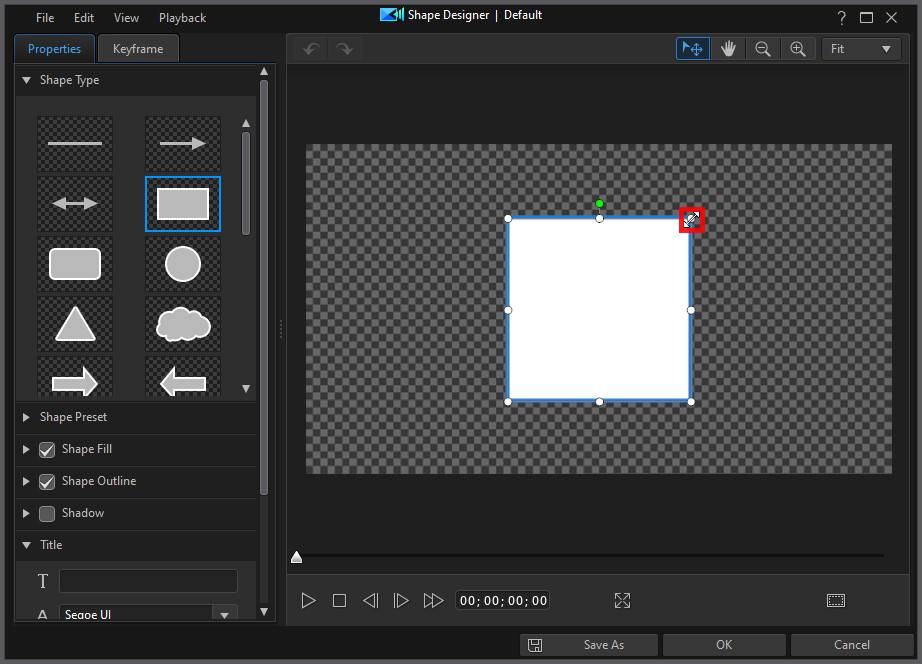
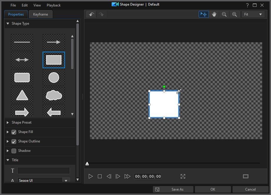
Note: the thin line and arrow shape types cannot be resized or made thicker. The length of these shapes can be changed, as well as adjusting their orientation by dragging the end points to other positions. |
•click and drag any of the resizing nodes to customize its shape.
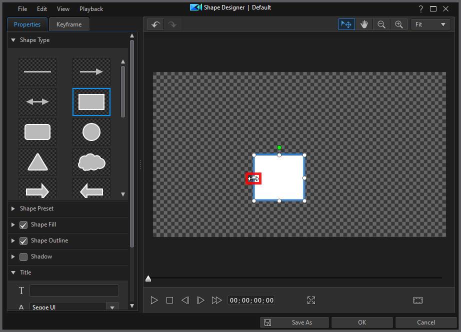
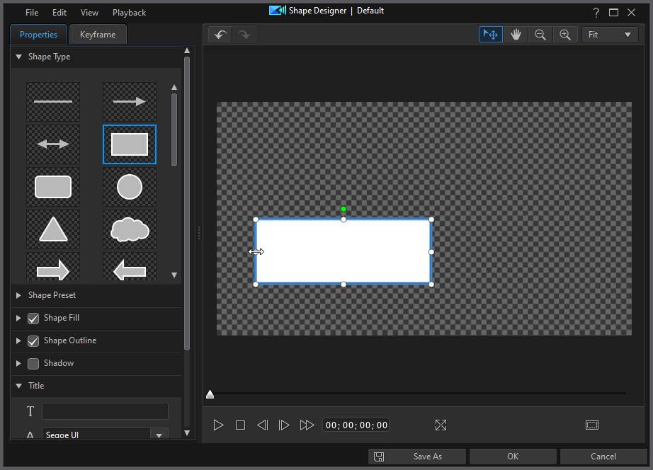
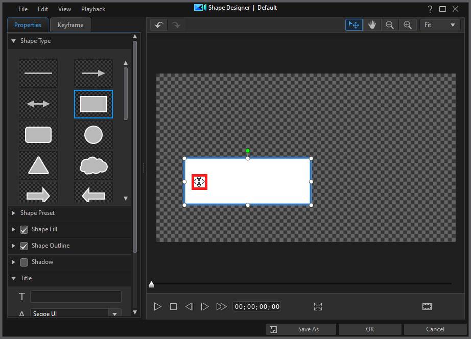
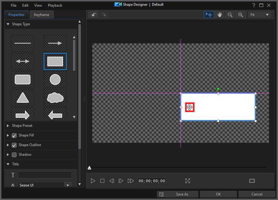
•click on the shape and drag it to a new position.
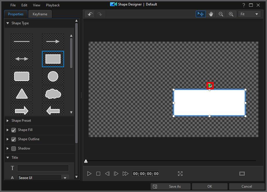
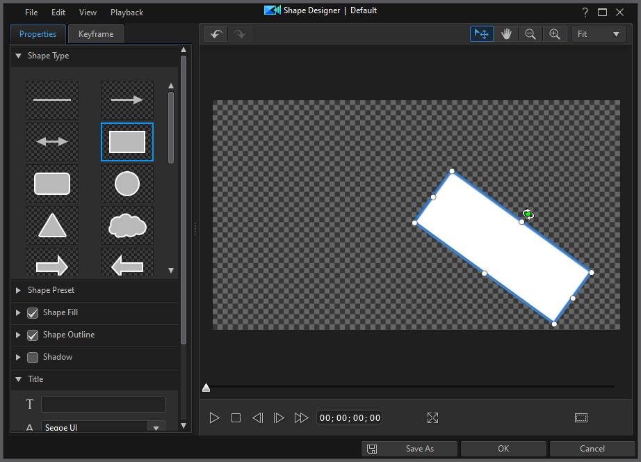
•click on  above the shape and drag it left or right to change its orientation.
•some shapes include a yellow node  that you can click and drag to a new position to change the shape's appearance.
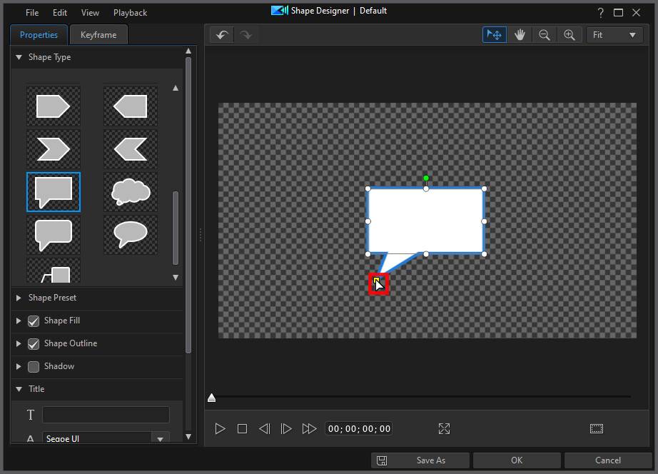
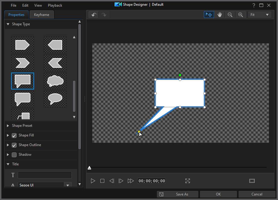
Note: you can use keyframes to customize the size, shape, position, and orientation of the shape. See Utilizing Shape Keyframes for more information. |
Using a Shape Preset
Select the Shape Preset option to instantly apply colors and borders to your selected shape and its title text. You can use the preset for your shape or as a template for editing the other properties.
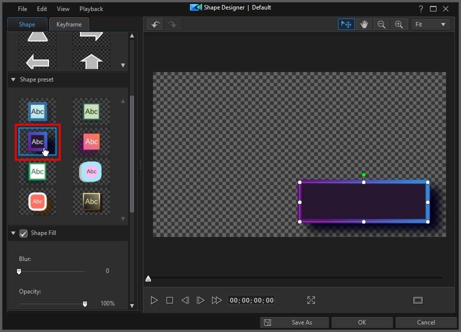
Note: if you want to remove an applied shape preset just click the undo button |
Applying a Shape Fill
Select the Shape Fill option to add color to your shape. When selecting the color of the shape, you have the following options in the Fill type drop-down:
•Uniform color: select this option if you want the shape to be one solid color. Click the colored rectangle to open the color palette and select the desired color.
•2 color gradient: select this option if you want the shape color to change from one color to another using a gradient. Click the colored rectangles to set the beginning and ending colors, and then drag the Gradient direction control to set which way the color flows.
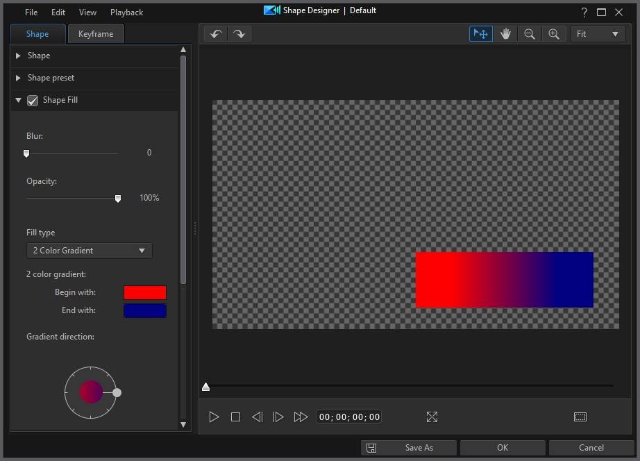
Once you have set the shape color, you can use the Blur slider to apply a blur on the edges of the shape. Use Opacity to adjust the shape's transparency, if required.
Applying a Shape Outline
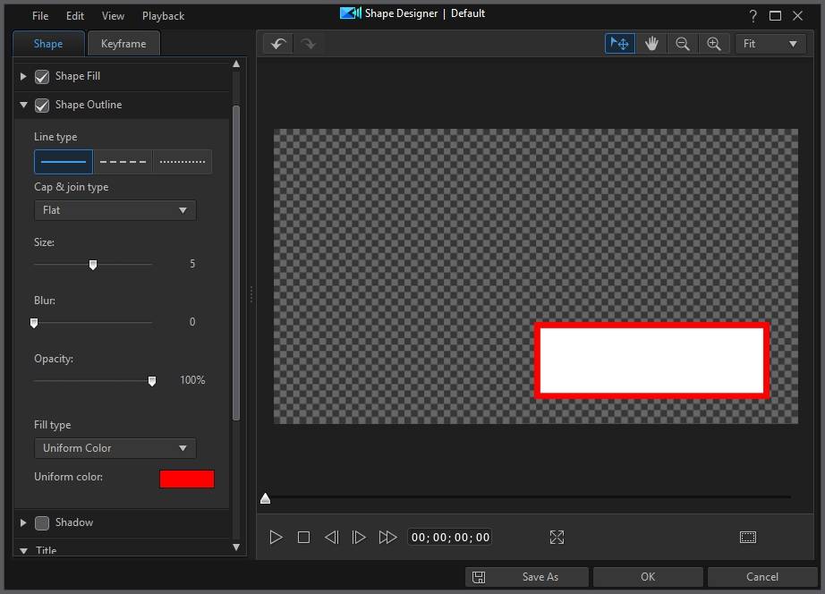
Select the Shape Outline option to add a border around the shape. First select the Line type you want as the border, and then which Cap & join type to use. Cap & join allows you to sharpen/soften the border corners/line dashes. Cap & join is not available for the dotted line type.
Use the Size slider to set the width of the border, and the Blur and Opacity sliders to customize its appearance.
Selecting Border Color
When selecting the color of the border, you have the following options in the Fill type drop-down:
•Uniform color: select this option if you want the border to be one solid color. Click the colored rectangle to open the color palette and select the desired border color.
•2 color gradient: select this option if you want the border color to change from one color to another using a gradient. Click the colored rectangles to set the beginning and ending colors, and then drag the Gradient direction control to set which way the color flows.
Applying a Shadow
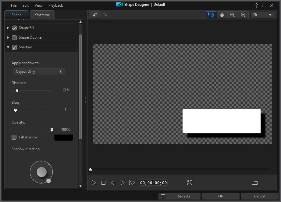
Select the Shadow option to apply a shadow on the shape. Once selected, choose whether to apply the shadow on the Object Only, or the Object and Border, if you applied a border. Select Border Only to just display the shadow of the applied border.
Select the Fill shadow option to choose a custom color for the shadow by clicking the colored rectangle. Use the other available options to change the Shadow direction and the shadow's Distance from the shape. You can also set the Blur and Opacity levels of the shadow using the available sliders.
Adding Title Text
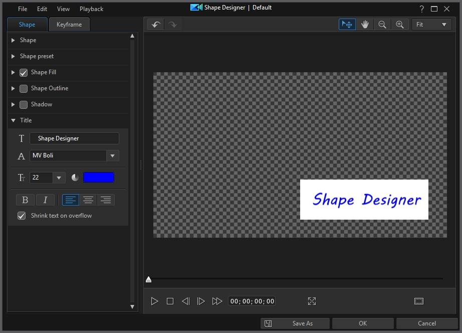
In the Title section, type in text in the field provided to add title text on the shape. You can modify the text's font type, size, style, color, and alignment using the available properties. Select the Shrink text on overflow option if you want the text size to shrink as you type, so that it fits within the shape.
 to use the TV safe zone and grid lines to help with the precise placement of the shape on the video. Select